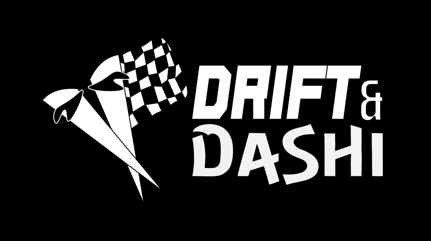
Module 1 Project - Logo
The purpose of this project was to create a cohesive logo system for Drift & Dashi, a (fictional) casual Japanese-fusion restaurant inspired by Formula One reserve driver Yuki Tsunoda.
The goal was to combine two distinct symbols: A visual representation of Tsunoda (checkered flag) and a symbol that connects to the restaurant’s Japanese cuisine (chopsticks). I needed to merge them into a single, identifiable unit. Through reducing the symbols into simplified forms, the design creates a unified logo that can effectively communicate both the restaurant’s identity and also the connection to F1.
The project also focused on developing a flexible logo system that could function across different sizes, layouts, and applications. Along with the primary logo, I was tasked to make horizontal and vertical variations to maintain clear hierarchy and visual integrity across all platforms, whether that’s business cards, bill boards, or even plates. I also adapted the logo into a black and white version, and also a version that was meant for dark backgrounds.
All of these versions demonstrated how my logo system can remain functional and recognizable across different contexts.
Research & Ideation
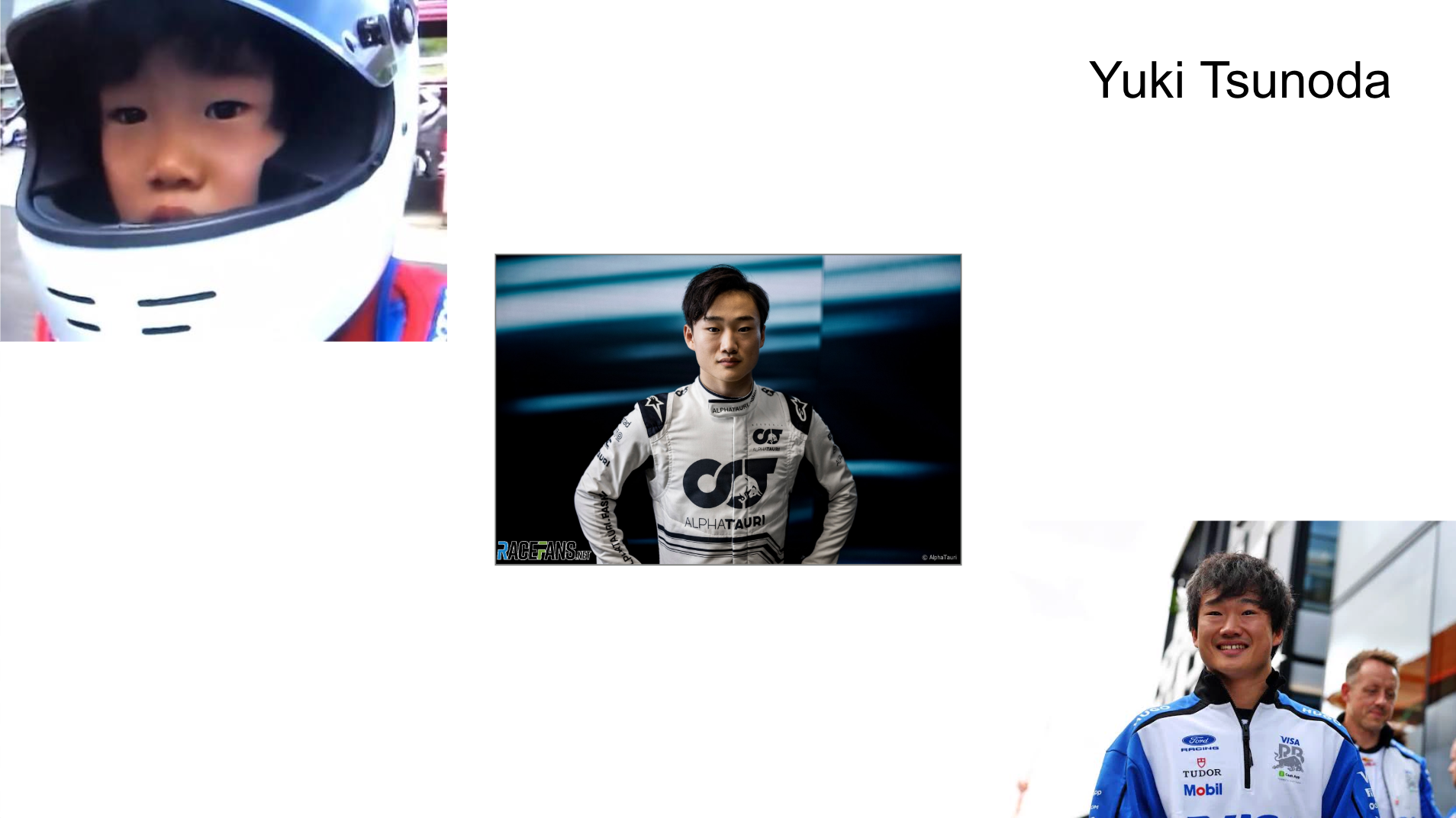
My research focused on the two main inspirations behind Drift & Dashi: Yuki Tsunoda and Japanese cuisine. Tsunoda is a Japanese Formula One driver who began competitive karting at age nine and eventually made his F1 debut with AlphaTauri in 2021. His connection to Japan and F1 made him a natural celebrity to inspire the restaurant’s identity. Outside of racing, Tsunoda has a strong passion for cooking and food and has expressed a lot of interest in opening a Japanese-fusion restaurant after his racing career concludes.
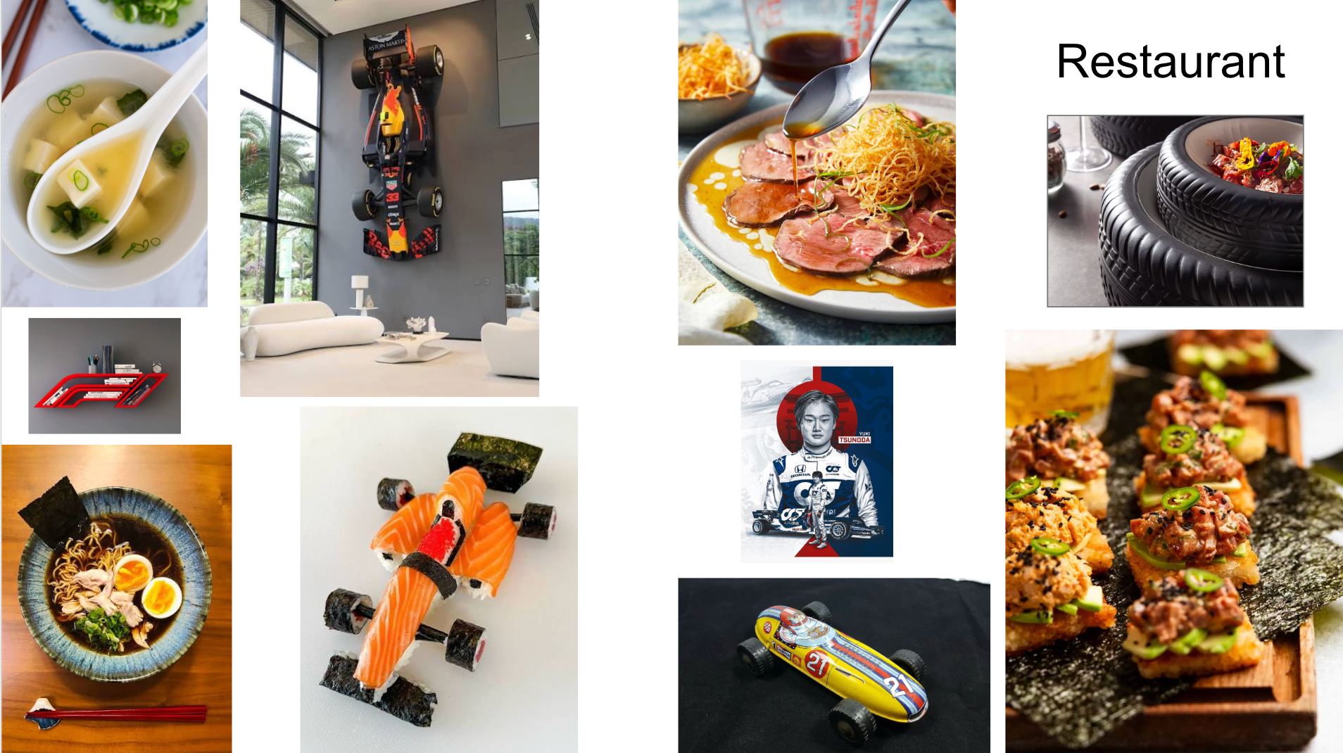
For the restaurant itself, I envisioned a casual Japanese-fusion concept with both dine-in and take-out options. The restaurant would have a relaxed, sport-bar-like atmosphere aimed towards young adults.
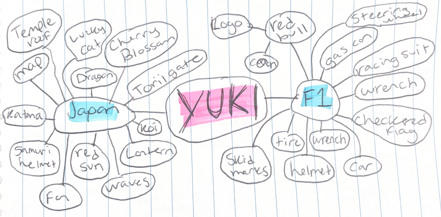
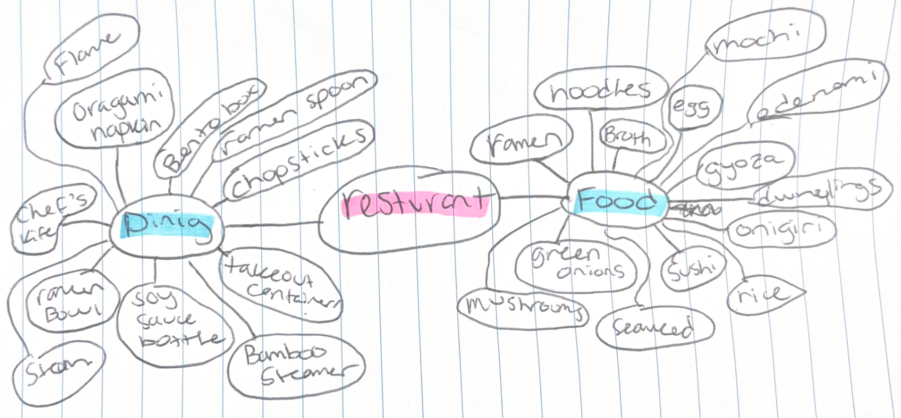
Because of these two influences, my ideation focused on finding symbols that could communicate both sides of my concept. I explored a lot of imagery before landing on chopsticks and a checkered flag.
Mind Maps
Conceptualization
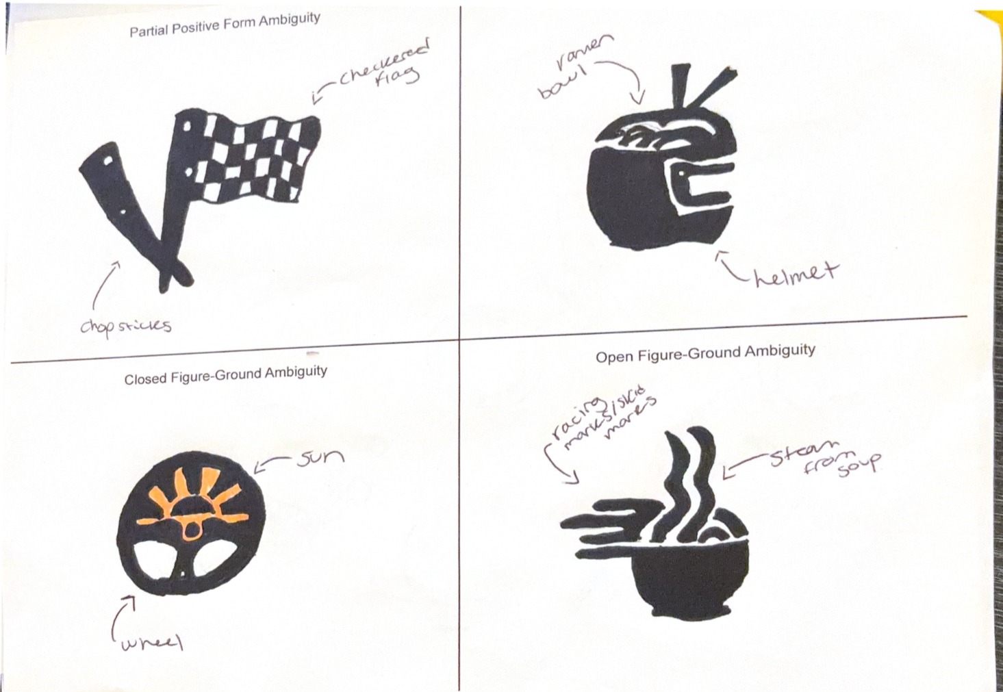
During the conceptualization stage, I created several thumbnail sketches to explore the several different types of visual ambiguity. Each concept combined imagery related to Japanese food/utensils and Yuki Tsunoda in different ways. The four concepts explored were partial positive form ambiguity, full positive form ambiguity, closed figure-ground ambiguity, and open figure-ground ambiguity.
I chose to move forward with the partial positive form ambiguity concept because it created the clearest connection between the two main ideas behind Drift & Dashi. The design combines chopsticks with a checkered flag, allowing both symbols to remain recognizable while still being connected and making a single cohesive mark.
Logomark Iteration
- Started with my partial positive form ambiguity by tracing it with the pen tool and using curvature
- This was the easiest way to get my sketch from paper to illustrator
- Refined the shapes to be a little smoother in order to make cleaner objects
- My sketch was a little rough and I wanted the logo to be much more stabilized
- Added more shapes to the checkered flag and lined them up
- Needed to find a way to have those tiny squares with the flags, this was the easiest and most natural way
- Added the chopstick bandanas with color
- Makes the chopsticks seem more believable as chopsticks and not just random pieces of wood
- Made small adjustments with size of the flag
- It was way too big and I didn’t know where I’d put the restaurant name
- Wrote out the name of the restaurant and chose fonts
- Finally making it a logo system
- Balanced the name and symbols together to create a logo system
- Was having a hard time fitting the restaurant name with the flag without putting it over the checkered pattern
- Made more adjustments as I made the flag smaller
- Found the sweet spot for how to balance both the restaurant name and the finished logo
- Made the three other versions of the system
- Copy and pasted, and then recolored or rearranged
- Saved and submitted
Logotype Iteration
- I searched on Adobe Fonts for any racing related themes and found a few I didn’t like
- I then looked at any modern/soft fancy fonts
- When choosing Basset as my “racing font”, I considered it looking strong and the weight it would hold as the top part of the logotype
- For the Dashi font, I liked how it looked like a font I’ve seen in a Japanese grocery store
- Putting them together, I made sure they weren’t too harsh against each other
Logo System
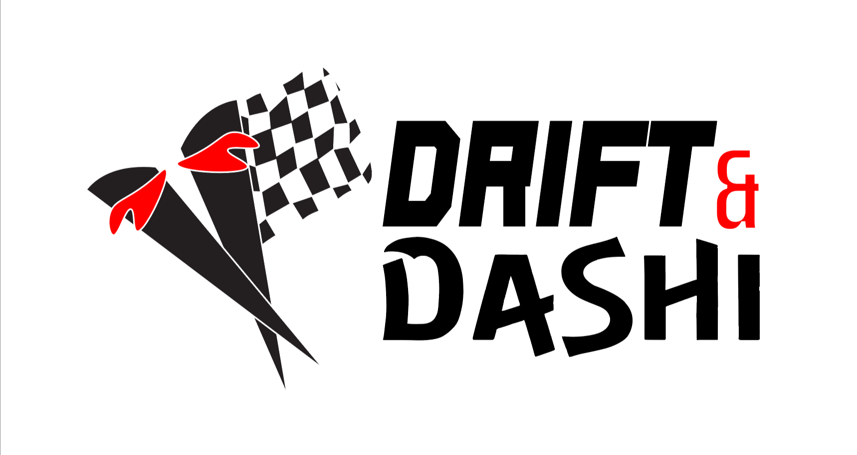
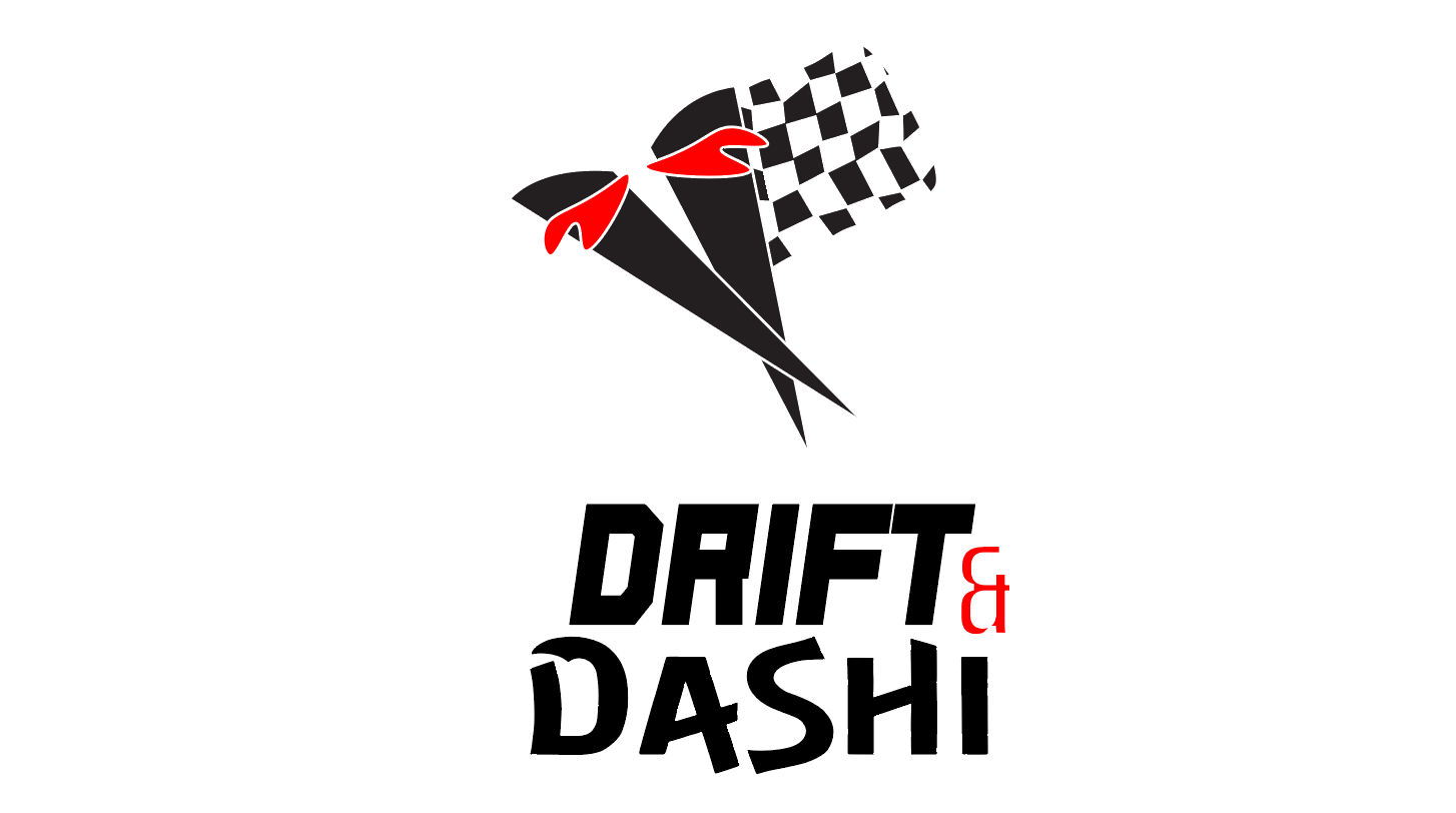
The stacked lockup creates a more compact vertical look and is better suited for square or social media applications, including profile pictures and stickers. Having this second lockup allows the brand to keep their identity in two versions.
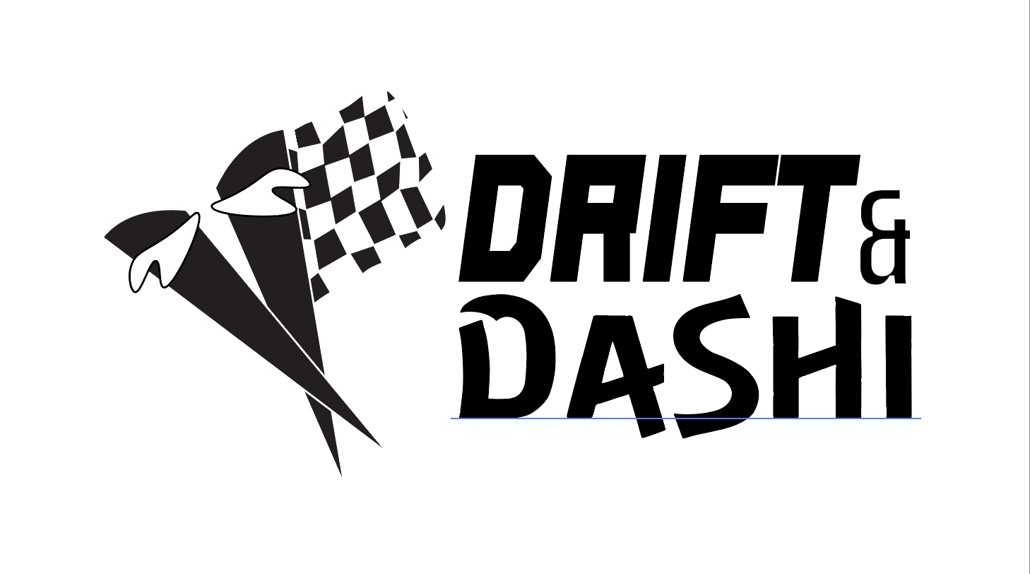
This one provides a simplified alternative for when color is not allowed/able to be produced.
This was created for use over dark backgrounds, whether that’s black or a navy blue. This also ensures that the logo will be able to be seen in all different backgrounds, and not just plain white.