
Samantha DeFily is a photographer and visual storyteller. She hopes to work in sports and/or politics.
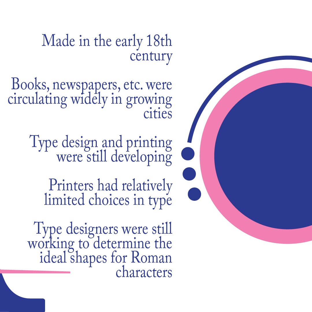
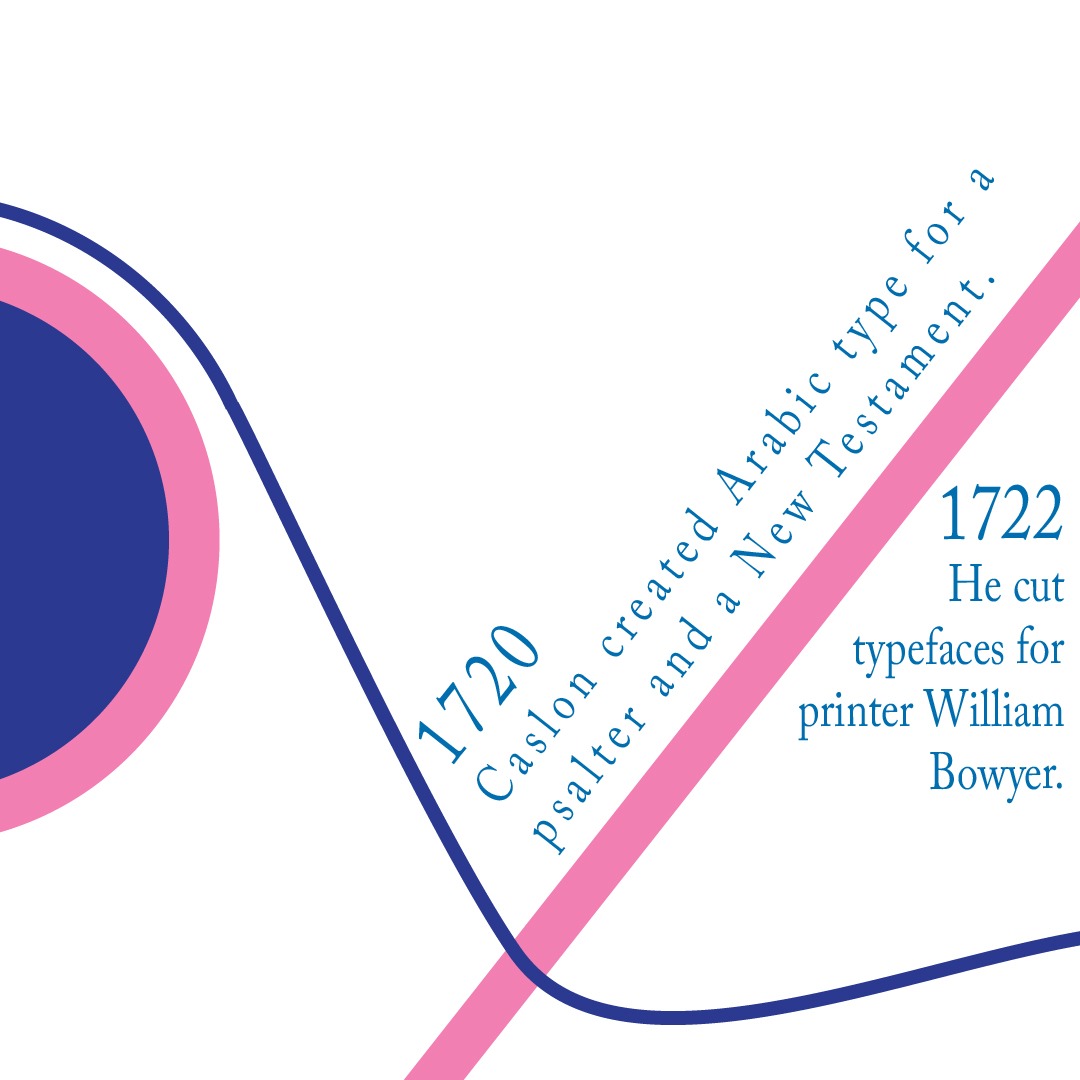
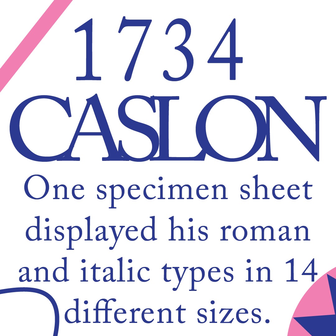
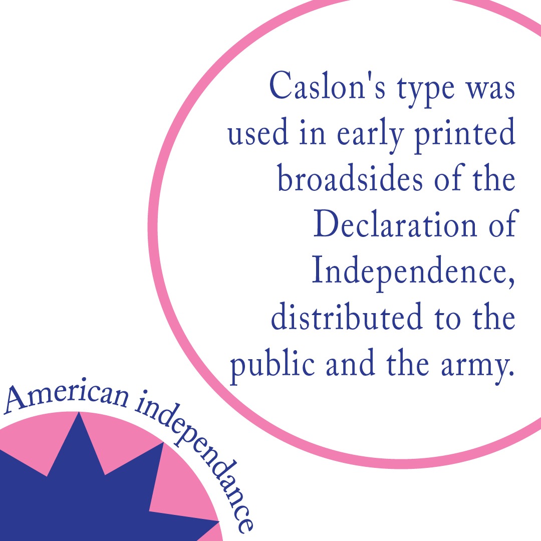
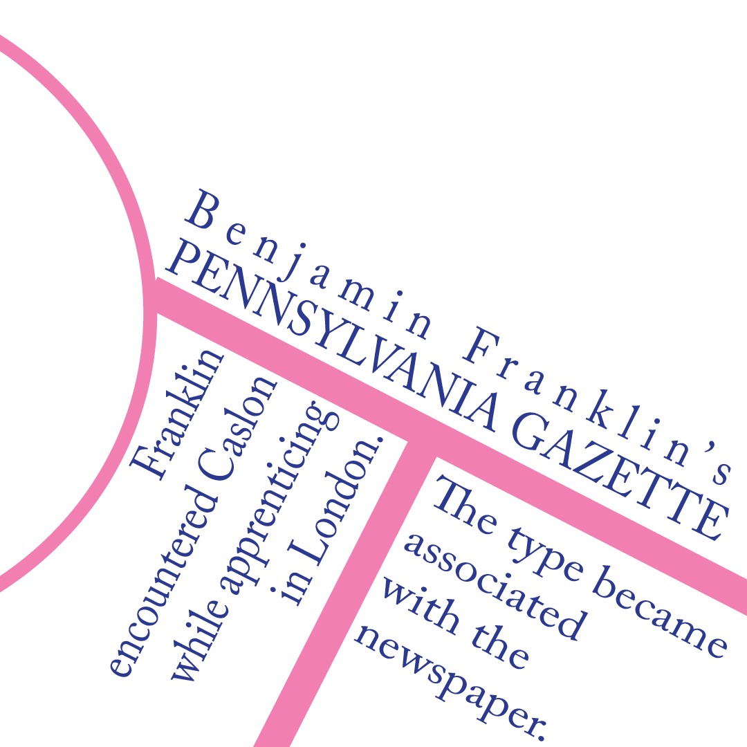
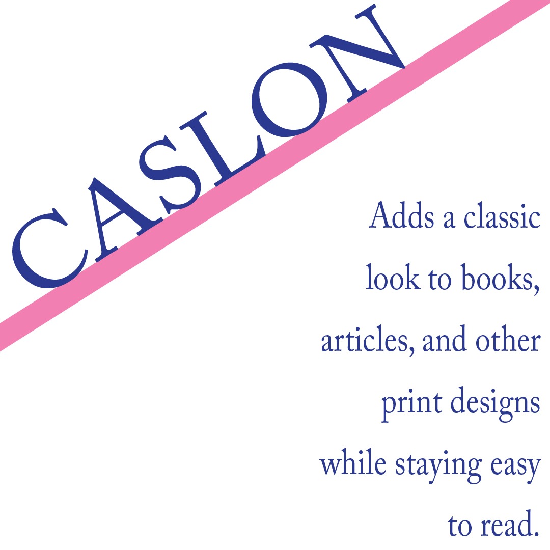
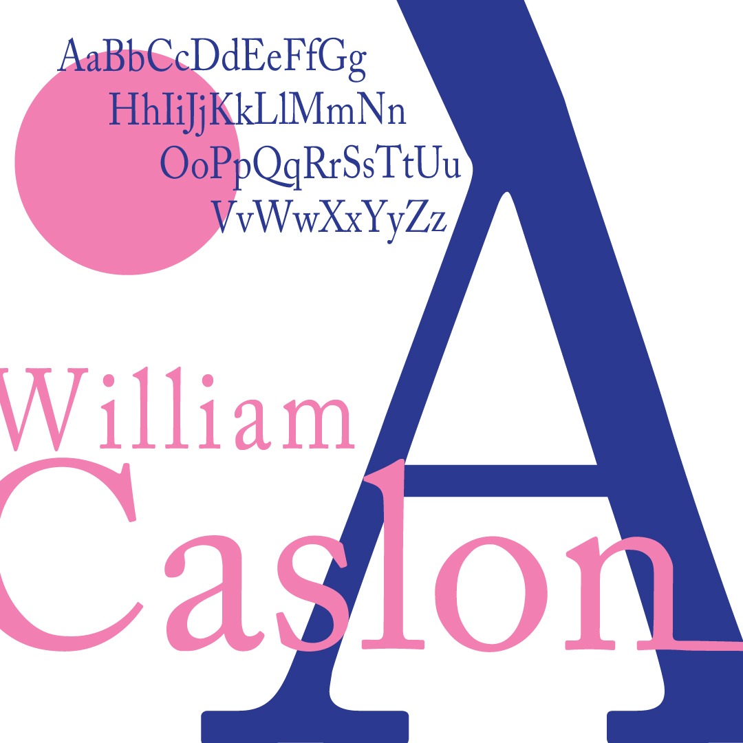
For the first part of this module we were assigned to create an 8-slide Instagram carousel. The information we were asked to research and organize was meant to communicate our typeface’s history. After picking out of a bowl, I was given Adobe Caslon. I used axial, bilateral, and justified type systems to balance out the information, and looked at how it was formatted on instagram to make sure it was compatible. I also separated the information out so that the pacing made sense and that there was a variety in how each slide looked.

Throughout the entire carousel, I used elements that crossed over between each slide to create continuity to guide the viewer's eye from one slide to the next. Since Adobe Caslon is an elegant and versatile typeface, I wanted the shapes/compositions to complement its characteristics. Keeping the overall design relatively simple allowed the letterforms to remain the main point while still giving each slide variety. The variation helped establish pacing and also prevented each slide from feeling too repetitive.
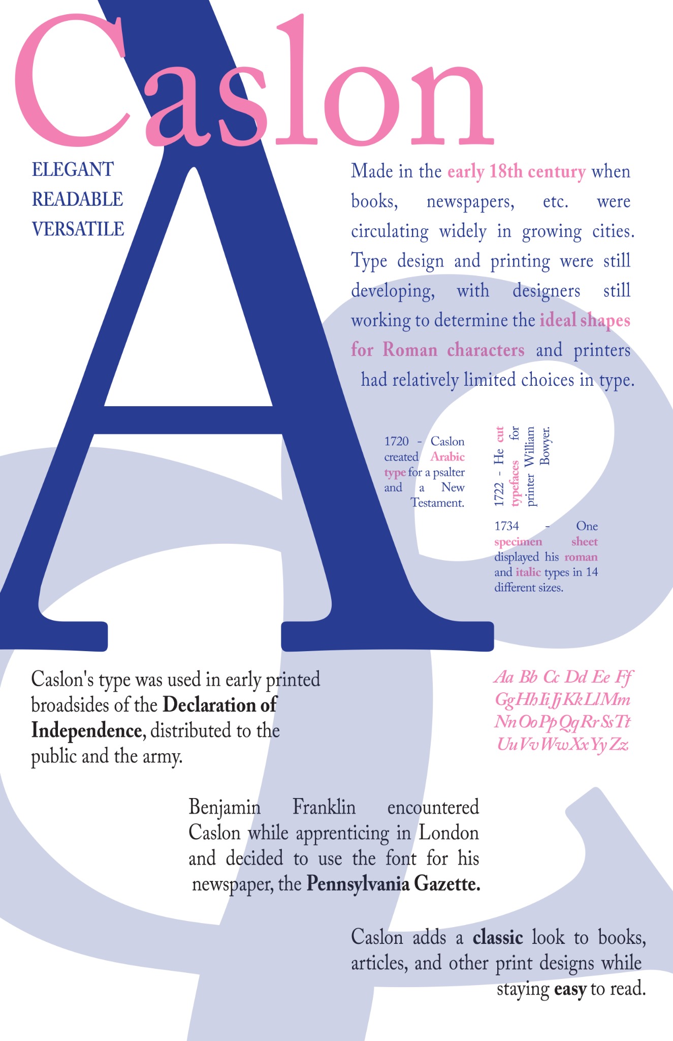
Going into the second part, I transferred a lot of the elements I had used in the first part and then all of the information that had been presented. I had to deconstruct the time-based sequence and changed it to a spatial composition so that it would flow through the poster nicely. To align things I used a modular grid and that way I was able to also space things out accurately. I then put the document in CMYK, so it could be printed in the right mode, and also made sure it was the correct resolution and size.
I carried over the visual design of the carousel to maintain what I liked while also adapting the composition to fit the different format of a poster. The modular grid helped establish a structure while still maintaining that alignment that I tried to carry over from the first part. By maintaining a clear hierarchy, and using what I know about spacing, the poster communicates in a way that's similar to the carousel.